
Attracts New Business
Signs are one major way of advertising your business. If done right, your sign is an economical way to get your message to potential customers.
How do you learn about a business? An annual survey since 1997 by Signtronics shows that:
| How Did You Learn About This Business? | |
| Your sign | 44% |
| Word of mouth | 38% |
| Newspaper advertisement | 8% |
| Yellow Pages | 7% |
| Radio Commercial | 2% |
| Television Commercial | 1% |
Brands Your Business
Designed effectively, your sign can combine with other media to help brand your business in the mind of a customer.
Consistency counts! The more reminders you give customers to remember who you are and what your business is, the better. Text and images on the sign should be repeated throughout your marketing mix, either within your company (stationary, catalogs, business cards, uniforms, vehicles, etc.) or when advertising elsewhere (TV, radio, Yellow Pages).
The goal of your business is to achieve “top of the mind” awareness. If a consumer in your community was asked which company first comes to mind in your industry, would that person think of yours?
Can Steer Customers Your Way
Over one-third of people surveyed say that they visit stores because they remember a sign when they saw it passing or they impulse shop due to seeing a business’ sign.
Passing traffic, trees, foliage, power lines, and street signs can limit the visibility of your sign. Before deciding on the placement of your sign, look at your store from the same angles as your future customers would.
Conspicuity helps someone distinguish your sign from its surroundings. Proper color, typeface, and lighting are all ways a sign can distinguish itself from busy surroundings. You have only a few seconds to grab the attention of passing drivers.
|
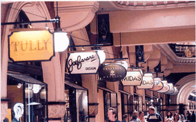
Signs placed amidst many visible objects may blend into the background to the point that they become invisible. |
Even large signs, if not designed and placed with care, can be overlooked. |


Legibility gives drivers or pedestrians with normal vision the ability to understand symbols and letters on your sign. Legibility depends on many things, including the size of the letters and the amount of white space, among others.
While it’s tempting to include as much information as possible when designing your sign, it’s more effective to keep the message very simple. Prioritize what you need to communicate. If you offer a unique service in the area, your address may be the most important element. If you’re competing against many other similar businesses, highlighting distinctive features may be a priority.
Clutter, or “sign blight” is sure to confuse the customer. Maintain a clear and straightforward message.
This table determines the distance at which a sign first becomes legible, based on how fast a car is moving.
| Speed of Traffic | Minimum Required Legibility Distance |
| 55 mph (88kph) | 440′ (134 m) |
| 50 mph (90 kph) | 400′ (122 m) |
| 45 mph (72 kph) | 360′ (110 m) |
| 40 mph (64 kph) | 320′ (98 m) |
| 35 mph (56 kph) | 280′ (85 m) |
| 30 mph (48 kph) | 240′ (73 m) |
| 25 mph (40 kph) | 200′ (61 m) |
Source: Schwab, Richard N.; also, Garvey, P.M., et al., 1996.
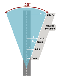
While driving, a motorist has a 20° range, or “cone of vision.” If your business has a sign whose setback (i.e., its distance) from the road is outside of this cone, then your sign is in danger of being overlooked.
The angle at which someone sees your sign influences how much time a driver has in order to react to that sign. A sign at 90° angle to the road would be the best option, while those parallel to the road are the hardest for drivers to see. In this table, Type I refers to signs that are at a 90° angle to the road, while Type II signs are those that are parallel to the road. See the difference in square footage?
| Speed Limit (miles/hour) |
Lanes of Traffic | Type I Sign Size (sq. ft.) |
Type I Height (ft.) |
Type II Sign Size (sq. ft.) |
Type II Height (ft.) |
| 25 | 2 | 25 | 12 | 50 | 12 |
| 25 | 4 | 32 | 12 | 70 | 12 |
| 35 | 2 | 36 | 20 | 75 | 20 |
| 35 | 4 | 42 | 20 | 90 | 20 |
| 45 | 2 | 75 | 35 | 100 | 40 |
| 45 | 4 | 90 | 35 | 120 | 40 |
| 55 | 2 | 150 | 50 | 250 | 90 |
| Urban Freeway | 300 | 74 | 450 | 90 | |
Source: Schwab, Richard N.
Even within your budget confines or the legal limits of your sign code, an experienced sign design professional can help you create an attractive and effective sign. Here are some tips to keep in mind:
Choose a typeface that is easily legible and one that fits your business’s style. Sans-serif fonts and open styles such as Verdana tend to be more legible. Make your message clear. Not every image can be translated onto a sign, so keep it simple. Because motorists have only seconds to read your sign, some sign experts suggest that text should only be three to five words in length. Abbreviations should not be used unless they are popularly known. Whenever possible, text should be arranged horizontally rather than vertically.
Maintain white space. An industry guidline is that 30 to 40 percent of the sign area should be blank space. Too much clutter distracts potential customers.
There are certain color combinations that are more legible than others. Howerver, the shade of the color is important, too. The most easily read combinations are black, dark blue or red text on a white or yellow background. However, keep in mind that it is not unusual for a community sign code to state that at least once color match that of your building.
Also, know that 8% of males in the U.S. are color-blind. It’s important to use color combinations that retain contrast when viewed by color-blind people. Blue and yellow, for example, is a good color combination, but blue-green or aqua on white or gray are difficult combinations for a color-blind person to read. Below are letter and background color combinations ranked in order of optimum legibility:
| 1. black on yellow | 9. white on brown |
| 2. black on white | 10. brown on yellow |
| 3. yellow on black | 11. brown on white |
| 4. white on blue | 12. yellow on brown |
| 5. yellow on blue | 13. red on white |
| 6. green on white | 14. yellow on red |
| 7. blue on yellow | 15. red on yellow |
| 8. white on green | 16. white on red |
Source: Claus, K.E. and R.J. Visual Communication Through Signage, Vol.1: “Perception of the Message.” ST Publications. Cincinati OH, 1974.
As a general rule, capital letters are more easily recognized, but tend to read individually. Lower case letters, on the other hand, are generally read as whole words or phrases. Sign design research designates six type styles as the most basic:

For the most part, reliance on the last four of these can be a problem. People are not used to reading these fonts for extended periods of time. Use them sparingly, if at all.
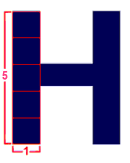
Capital and lower case letters, with the exception of script styles, are generally equally legible. As a general rule, the width of a letter’s horizontal stroke should be approximately 1/5 of its height. In choosing numerals, it is generally accepted that Roman numerals slow readers down because they are more complex and less familiar to the viewer than Aarabic numerals.
Letter Heights
If a sign is to be effective, then it must be legible at enough of a distance to help a driver respond. Generally, letters with a taller and wider “stroke” can be read from further away. These are the recommended letter heights to enable legibility at various speeds of highway traffic:
| Speed of Traffic | Recommended Letter Height |
| 55 mph (88 kph) | 16.5 in |
| 50 mph (80 kph) | 15 in |
| 45 mph (72 kph) | 13.5 in |
| 40 mph (64 kph) | 12 in |
| 35 mph (56 kph) | 10.5 in |
| 30 mph (48 kph) | 9 in |
| 25 mph (40 kph) | 7 in |
Signs for Success Seminar Handbook, Nevada SBDC, 2001.
Letters of this height at these speeds should be legible to a driver for six seconds. However, if your business appeals mostly to tourists, they might need more reaction time because of unfamiliarity with your area. The longer the reaction time required, the greater the recommended letter height.
If you’re open for business at night, your sign needs lighting. On-premise signs can be lit either internally or externally. The type of lighting used depends on your sign’s location, the architecture of your building, the materials used to make the sign, and any limitations imposed by your local sign code. Here are just a few of the many lighting options:
- Light fixtures mounted above a flat wall sign.
- A cabinet-style plastic case lit from within with flourescent or neon bulbs.
- Channel letters lit from within by neon tubing or lighting.
- A light behind the sign face, illuminating the main message or symbol, or the sign background, or both, through a translucent material.
Ultimately you would want to choose something that looks nice, is suitable for your business area, yet is still distinct. Ease of maintenance should also be a factor.
As a business owner, you should realize how important the location of light fixtures on your signage can be for their readability. Certain light fixtures above or beside a sign face can cast a shadow over the sign, obscuring the message. Keep that in mind, as your sign works 24 hours a day.